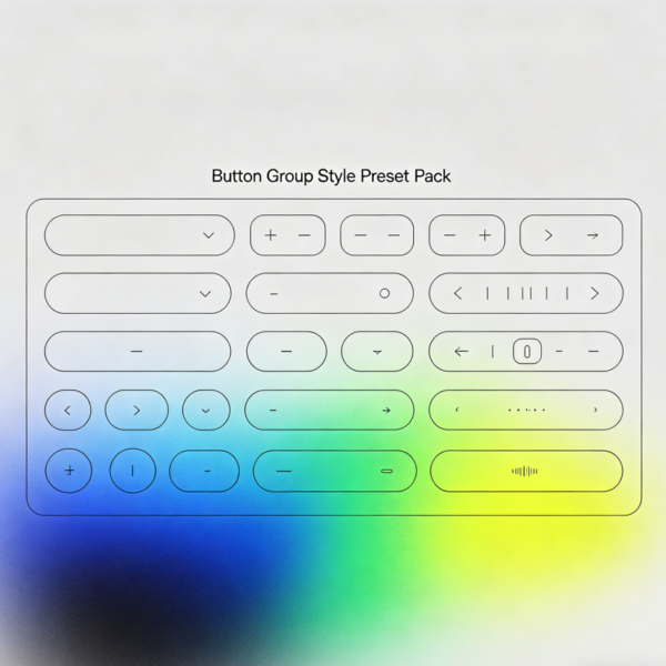
This style library offers a collection of preset visual themes for common website form controls and buttons. It covers various states—such as default, hover, and active—for input fields, checkboxes, radio buttons, dropdown menus, and submit buttons. The design unifies elements such as rounded corners, borders, and focus feedback effects to ensure a consistent and cohesive user experience during form completion.
Features & Content:
You will receive style files for form components, button color schemes, and examples of validation message styling. The library includes visual definitions for disabled, hover, and active states. All styles are applied via CSS class names, ensuring they do not interfere with the default appearance of other elements on your page.
Delivery Instructions:
Upon placing your order, the system will provide a download link; the file package includes a “Style Usage Examples” document. Once you have imported the stylesheet into your website, simply add the corresponding preset class names to the relevant elements to apply the styles. Please note that this product does not include back-end form processing logic or data storage functionality.